
7 Tips for A Captivating Menu Design

A menu is like a handshake. Why? It forms your very first impression of someone. It is vital for restaurants to have an attractive menu that instantly captures attention. It represents who you are, and what your restaurant is all about. It is the first defining factor that influences a customer’s experience. If you want your customers to keep coming back, read on for 7 crucial menu design tips. Your restaurant will definitely nail all of them!
1) Keep it limited
We all love variety! Which customer doesn’t love picking a dish while the waiter silently waits for them to make up their indecisive minds?
Spoiling your customers with as many dishes as possible may seem like a great option, but as the saying goes- less is more. Customers may struggle with a menu loaded with way too many options, which often makes them revert back to an old, familiar dish. If that dish is a low margin item, you could possibly lose profits from other menu options. To keep from confusing your diners, have 5-7 items per category.
To learn more on how to increase your profit margins and keep your food costs in check, Food Market Hub offers a hassle-free procurement system that manages your inventory. Find out more here.
2) Illustrations
When dining in isn’t an option, digital menus can still look attractive! Illustrations can fully communicate your restaurant’s mood or ambience, without customers actually having to be there. Depending on your restaurant’s vibe, illustration keeps your menu versatile. Whether it’s vintage, modern or minimalistic, there isn’t any harm in spicing things up. While photos are also a great way to draw customers to your dishes, too many doesn’t leave much room for the imagination. To keep your customers wondering, two or three photos will do!

3) Description
Have you ever read a description of a dish so mouth watering, you just had to order it? Short descriptions not only help customers understand what they’re ordering, but engaging ones can paint your dish in a different light. It may also save time on questions from your diners. Make sure to include potential allergens, or indicate if the dish is spicy. Of course, a short, engaging description always works the best.
A plus point would be including a number of recommended dishes, which most customers definitely take note of when making a decision. Would you rather order a steak or a tender, hand-cut, steak broiled to perfection? You decide!
4) Typography
Different typographies are a great way to show off your brand. And no, we don’t mean fonts like Times New Roman. Fonts like Script and Sans serif give an entirely different look to your menu. It could either give it a classic, distinguished feel or a modern, bold look.
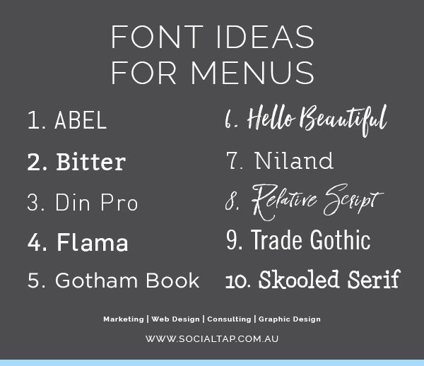
It can even be used to guide your customers, by distinguishing different names and descriptions of menu items. Your choice of typography and color combinations are essential, as they can attract customers to a specific part of the menu that you want to stand out.
5) Color
Colors are fun! Spice up your menu with a pop and dash of color. Like a sprinkle of salt, the right selection of colors really brings out the flavor in your menu. Different colors imply different meanings- for example, red inspires action. It not only represents your restaurant’s mood, but highlights certain menu items. The McDonald’s menu uses both red and yellow, which are “happy” colors.
Other fast food chains like KFC and Burger King are also associated with these primary colors. Have you ever wondered why? In color psychology, red acts like a huge STOP sign: it makes you pause and pay attention. It elicits feelings of hunger and desire. On the other hand, yellow represents all things comforting and friendly. You may even subconsciously think of burgers and fries when seeing these colors.

Colors represent your restaurant’s brand. The most popular restaurants in the world have strong associations with their colors, increasing brand recognition among their target consumers. Take McDonald's again as an example: they don't even have to include their brand name in their ads. All they need to do is include yellow and red in a certain shape, and we automatically associate the graphic with McDonald's.
6) Price Alignment
Don’t let your customers be put off by price scanning- scouring the menu for the least expensive dishes. How do you avoid this? First, you can leave out currency signs on the menu. Completely omitting them would encourage customers to spend more. Second, always choose subtle typography and colors when labelling your prices.
Choosing brighter, bolder visuals for prices act like warning signs to your customers. Always opt for a neutral color palette! Lastly, never rank your prices from lowest to highest. Be sure to mix them up to avoid customers scanning the top and bottom of your menu. You can find out more on how to price your menu here.
7) Placement
This may be surprising, but the location of each dish on your menu affects what customers order. The top center is a position your customers’ eyes will be drawn to first, whether your menu is vertical or horizontal. The next step would be the right, as people generally read from left to right. However, another popular eye-scanning pattern has emerged: the F- Pattern. People first read horizontally, forming the first part of the F, then downwards vertically, scanning for interesting words. When they find a word of interest, they read the line, which forms a final part of the F. This is a fresh perspective on how menus can be read, and should be taken advantage of.

When handed a menu, people also automatically look at the back. This is a great location to highlight attractive specials and promotions. Next, bold typography and large headers will be your best friends! People tend to scan items directly under attractive headers. Of course, always separate your menu into sections for better readability.
Conclusion
Implementing these tips will definitely boost your restaurant’s menu, and in turn, image. They not only paint a better, and clearer image of your brand, but contribute to increasing your sales! An added advantage is acquiring a smooth system for both procurement and inventory that does the work for you, so you can focus on other things like your menu and branding!

If you're interested in a hassle-free system, Food Market Hub helps to boost your profit margin by 13% and reduces 57% time spent on admin work. Contact us and join our world of 3,600 restaurants and suppliers!


